The problem
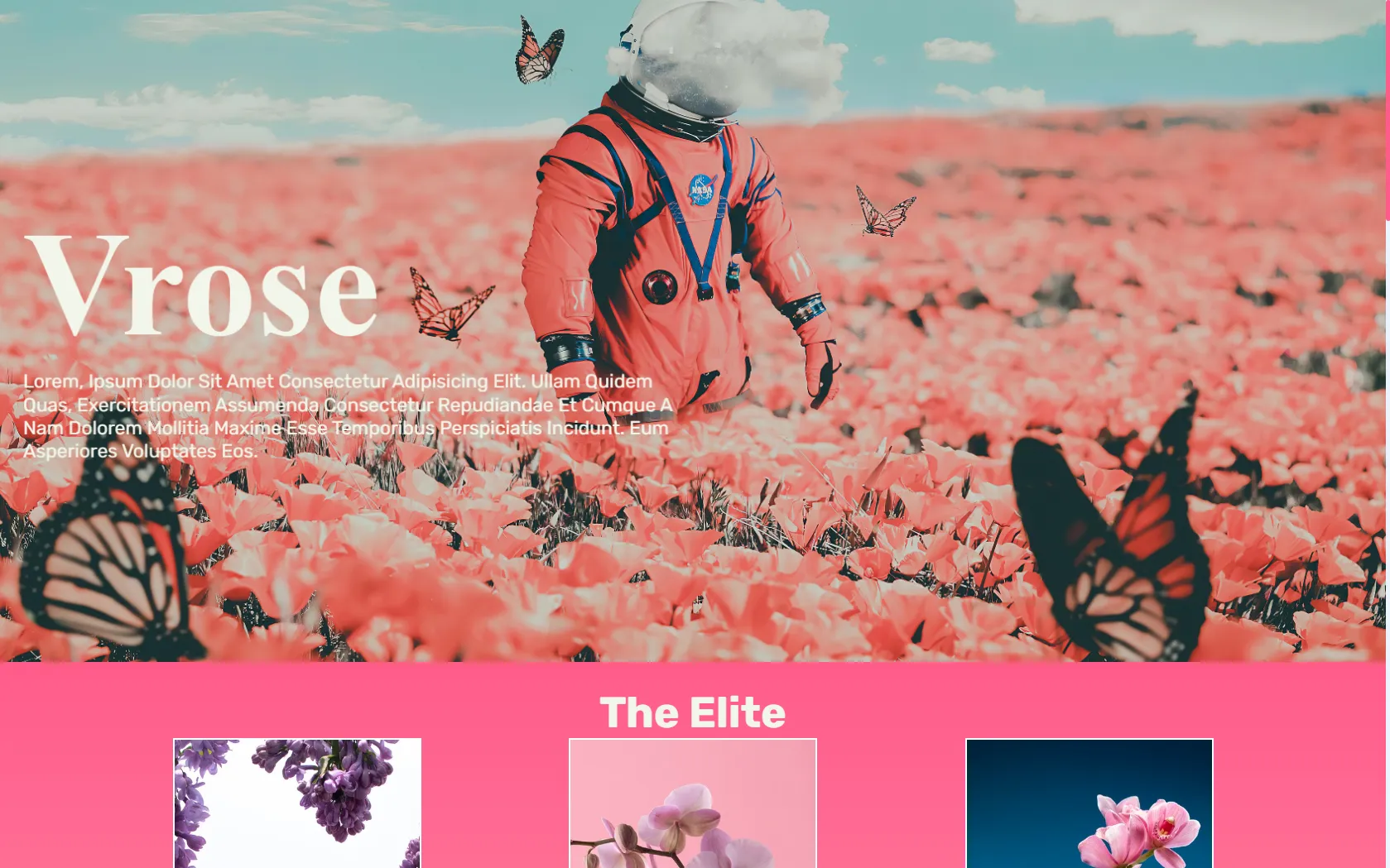
A flower shop sells a feeling as much as a product, so its page has to look as fresh as the flowers. Vrose was my second shopping landing design, made to practise presenting products with mood and space.
What I built
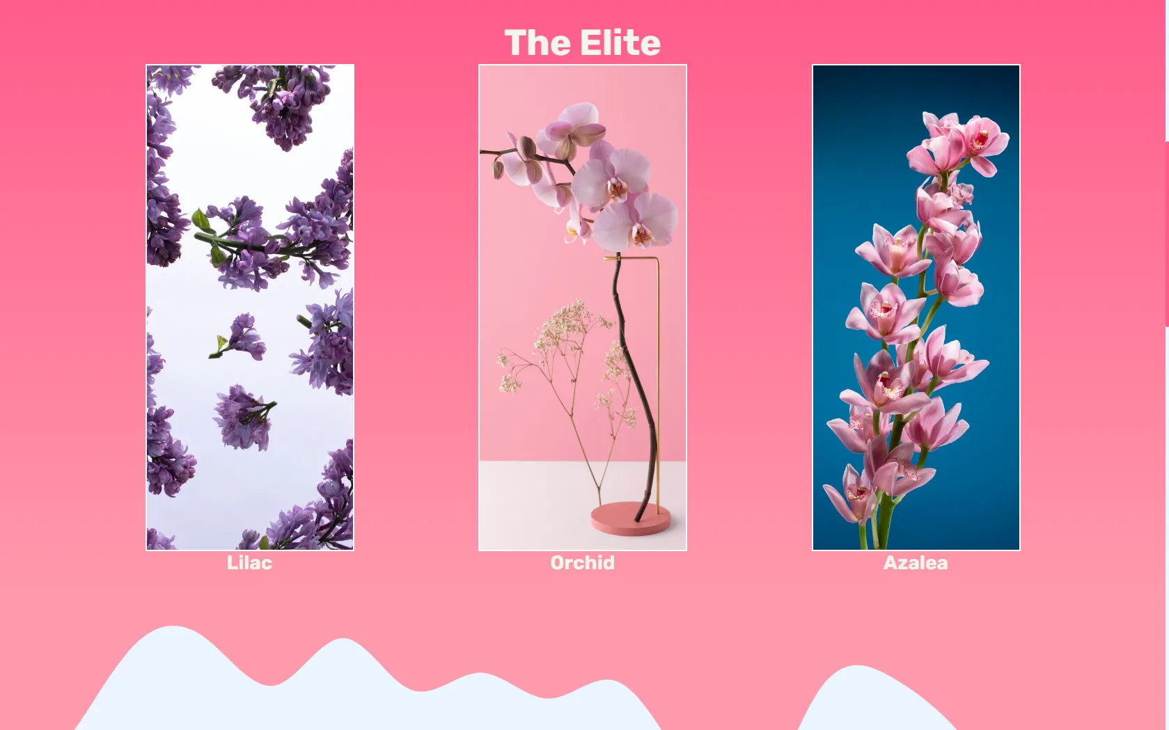
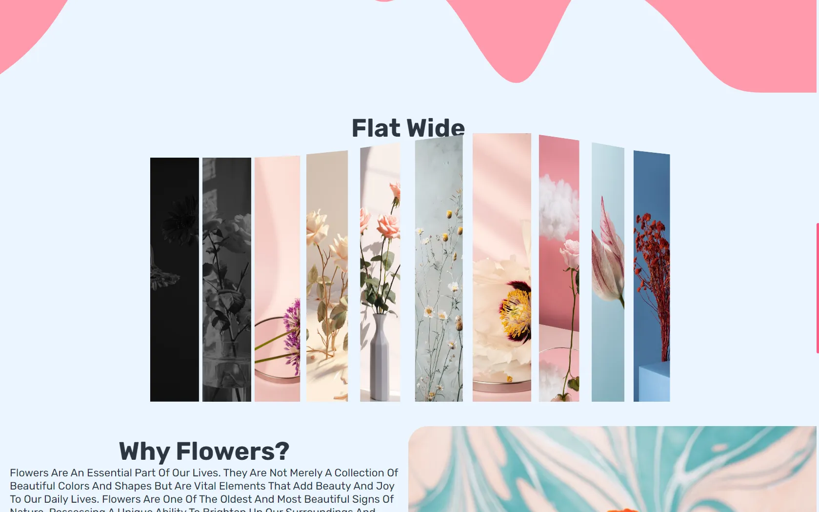
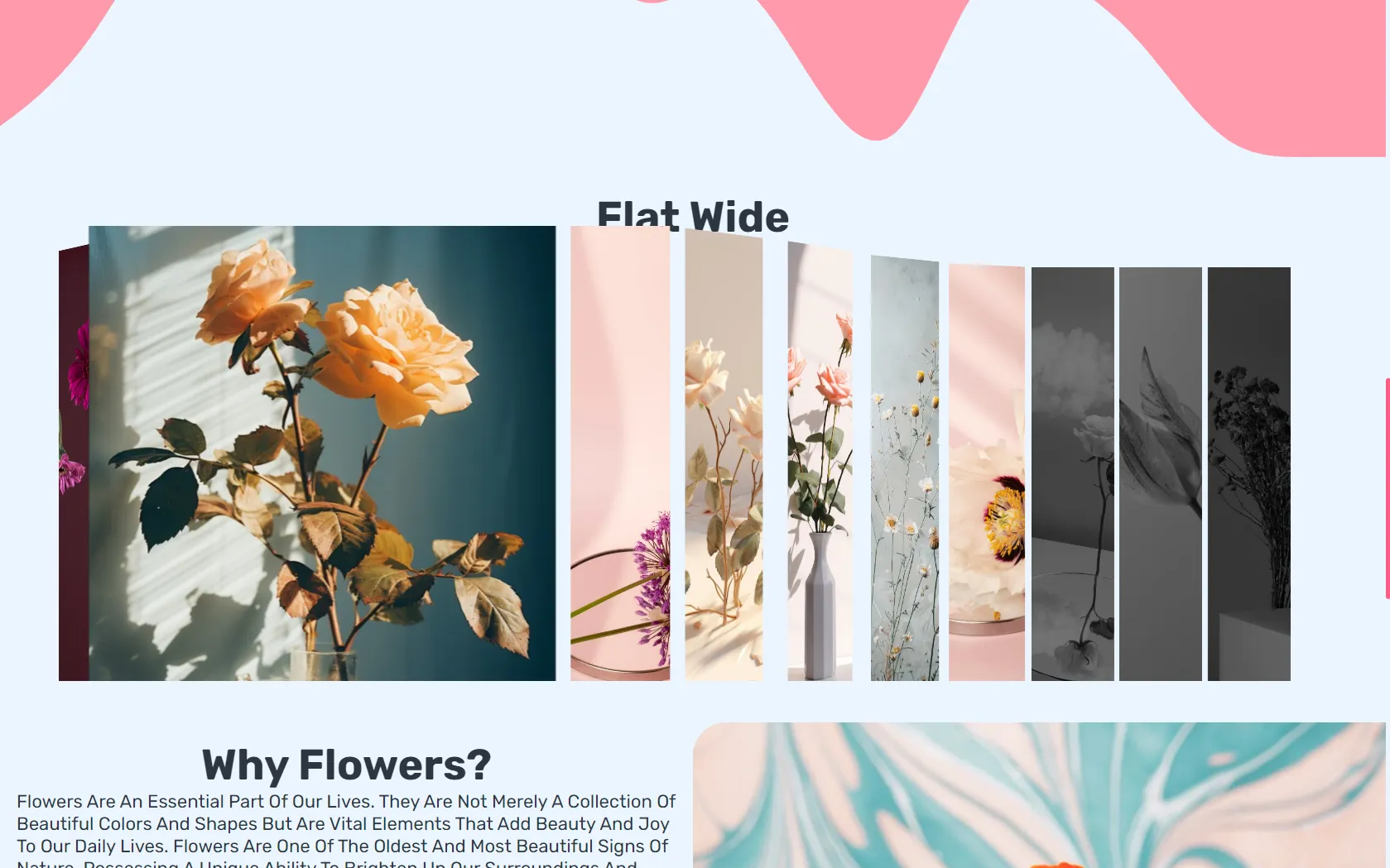
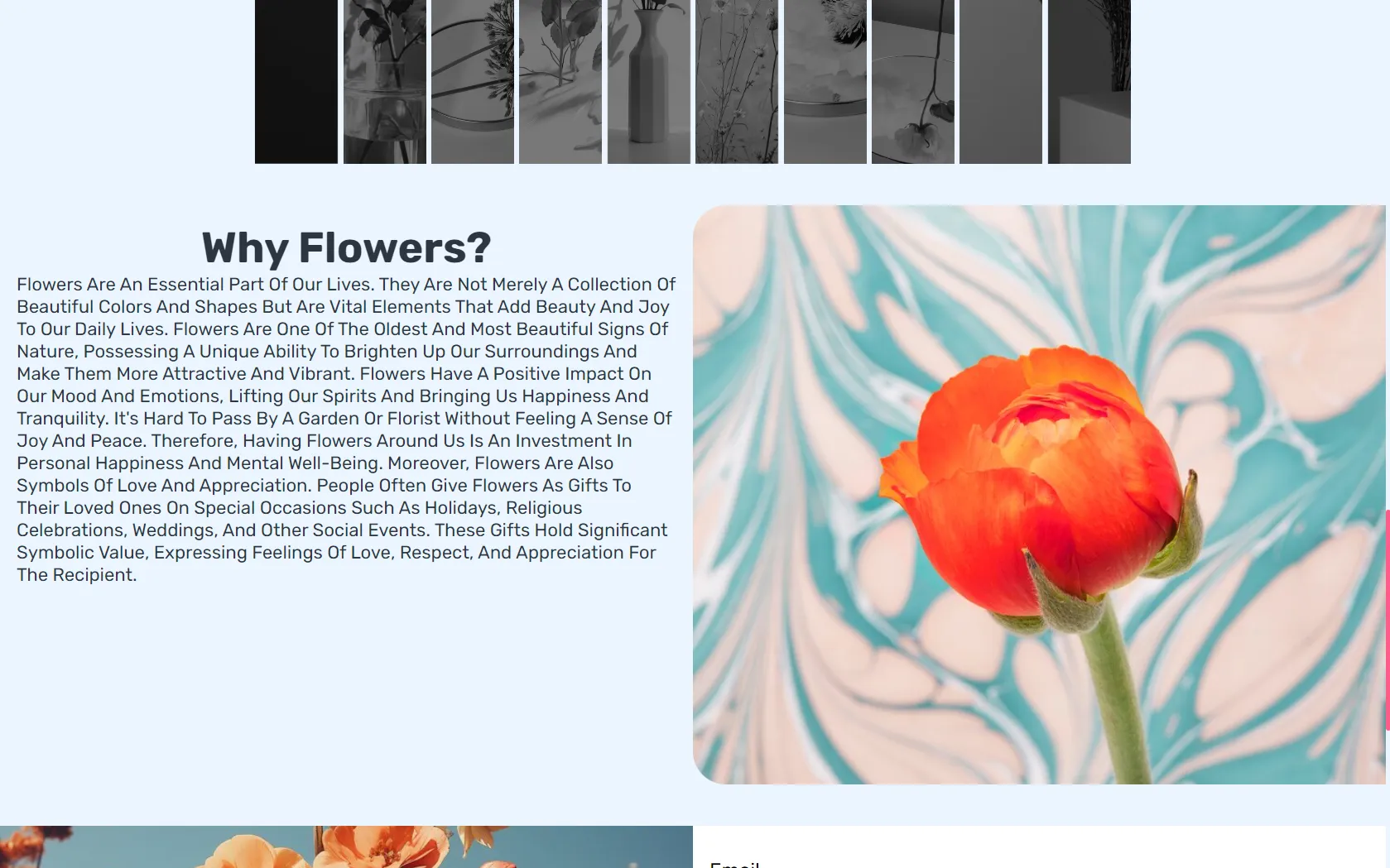
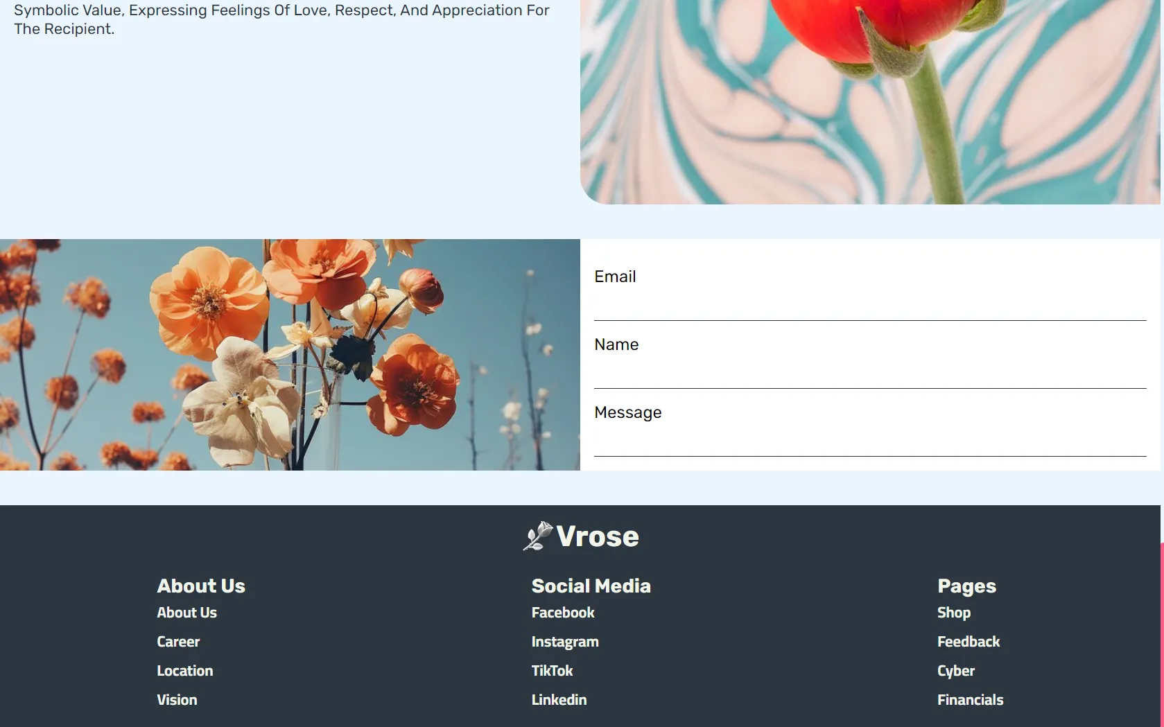
A single landing page for a fictional florist called Vrose, "Nature in Real". It opens with a large hero, then a product range (The Elite, Lilac, Orchid, Azalea and Flat Wide), then a "Why Flowers?" section about why flowers matter in daily life, and a footer.
Decisions
- A soft, warm palette. The accents run on a pink gradient (from #ff5c8a to #ff99ac) that echoes petals rather than a typical shop's red sale banners.
- Slow motion in the header. The hero background drifts on a 15-second loop, slow enough to feel like a breeze instead of an animation competing with the products.
- Three typefaces, three jobs. Rubik, Exo and Cairo are self-hosted with the page, so the look does not depend on an outside font service, and Cairo leaves room for Arabic text later.
- Plain HTML, CSS and JavaScript, keeping the page light and every effect hand-written.
- One clear breakpoint. Below 768 pixels the layout restacks into a single column, so the products stay large and easy to tap on a phone.
The hero copy is still placeholder text: this is a design study of layout, color and pacing, not a live store, and it says so honestly.
Where it stands
Built in May 2024 as "Shopping Landing Design, Vol. 2". Live at vrose.temrevil.com, source on GitHub.